PROJECT, DURATION, ROLE
16th Street Ceramics needed a responsive website that would help their members access their accounts and create studio reservations across devices. This project was designed for the completion of the Google UX Design Certificate. I served as the sole researcher, designer, and project manager.
PROBLEM, GOAL
Previously, due to the organization’s size and history, all account management had been taken care of by staff on a legacy system. This design will help users manage accounts and reservations on their own, freeing up staff time and creating convenience for users.
OUTCOMES
After an initial low-fidelity usability test with almost unilaterally negative feedback, we bounced back to create a modern, responsive website design where users are able to easily complete all the tasks that the client required – managing multiple accounts and making studio reservations through a usable and accessible interface.
USER RESEARCH
For this project, I dug into user personas based on interviews with current users of 16th Street Ceramics, which I used to create user journey maps to better understand the pain points encountered while using the site.
While I anticipated designing a typical user account flow, there were a few unique needs that I uncovered during this process that I hadn’t accounted for. These helped us to innovate features that became critical to our final product.
Persona: William
William is a retiree and grandfather who needs to easily book ceramics classes for himself and his grandchildren because he wants to spend time being creative and learning with his family.

User Journey Map: William
By walking through William’s journey of managing accounts for both himself and his grandchild, I identified the importance of managing multiple memberships under one account.

Persona: Rebecca
Rebecca is a former art student and busy professional who needs to efficiently and easily book ceramics studio time because she wants to start a side business selling her creations.

User Journey Map: Rebecca
Rebecca, as a more advanced ceramicist, wanted ways to manage her certifications and studio permissions through her account page. She also found it frustrating to have to enter her personal information every time she made a studio reservation.

Pain Points
Ability to manage more than one user
Many 16th Street members were families or couples who would prefer to manage all of their classes and reservations on a single account.
Inputting personal information
In the studio’s current system, users had to input their personal information every time they reserved studio time, a huge hassle for regular users.
Confusion over qualifications
Users reported feeling unsure about what the levels of certification classes available entailed or meant for them personally.
SITEMAP & INFORMATION ARCHITECTURE
In creating the sitemap, my goal was to develop a simplified, easy-to-navigate process while still helping users accomplish everything they need to. From the original sitemap, I was able to streamline the information architecture even more during future iterations.

PAPER WIREFRAMES
I used the sitemap to brainstorm design ideas with paper wireframes, continuing to prioritize simple, easy to navigate designs that would work on desktop as well as over various screen sizes.
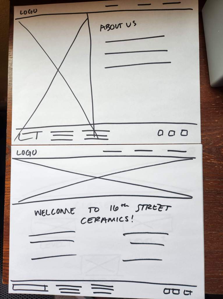
Screen Size Variations
Once I established the basic outline of the designs, I created wireframes in tablet and mobile sizes to ensure they worked across platforms. For tablet and mobile, I added a hamburger menu and simplified the headers and footers to ensure seamless functionality without compromising content.

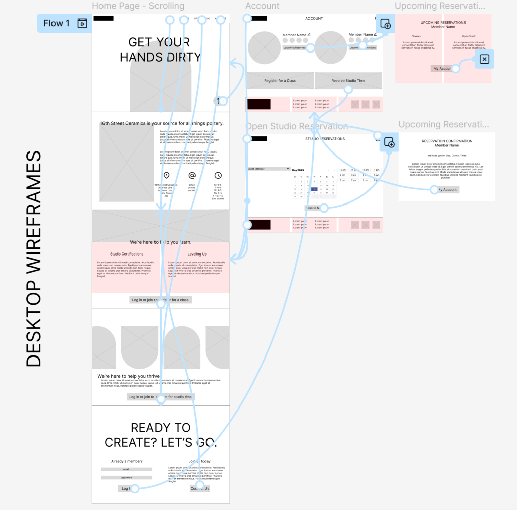
DIGITAL WIREFRAMES
In transitioning to digital wireframes, I honed in on our users’ need to manage more than one member under a single account, developing an atomic design that could easily be simplified for a single user or extended for a whole family. Peer feedback helped me develop the graphic “badge” system to track certifications and classes per our user personas.

Screen Size Variations
As I modified our digital wireframes to work on multiple screen sizes, I explored ways to keep all elements present so as not to favor any one type of user, resizing and rearranging elements for ease of use.

USABILITY STUDY FINDINGS
An unmoderated usability study was conducted with 5 participants and was a game changer for the design. While the feedback was not what I had hoped, ultimately these insights helped me level up the design.
Outdated
User feedback indicated that our design was too clunky and outdated for a modern website.
Difficulty Navigating
Users didn’t always know where to click to get what they wanted.
Not Exciting
The users found the design basic and not something that would draw them to patronize the studio more often.
LOW-FIDELITY PROTOTYPE
Because user feedback indicated the site was on the wrong track, I developed additional digital wireframes for the low-fidelity prototype, incorporating a more modern, scrolling design and simplified site structure. The new design had only one path into the account and any class or studio reservations, as well as a more modern aesthetic.
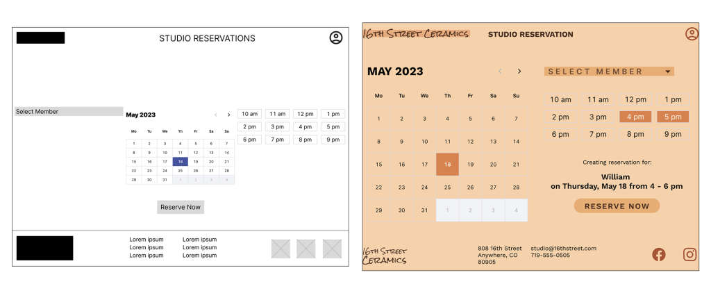
MOCKUPS
While peer review sessions responded positively to our ideas for modernizing the design, sometimes theory is easier than reality. I had to adapt the design to achieve the photo overlay look we hoped to achieve in an accessible way, adding the color blocks to make the text readable.

Another area where peer feedback was invaluable was the calendar reservation page. Especially in the desktop version, I struggled with making all of the steps make sense while still organizing everything well on the page. In the final design, the space is used well and creates an easy process.
Screen Size Variations

HIGH-FIDELITY PROTOTYPE

ACCESSIBILITY CONSIDERATIONS
1.
Especially because the main page of the site is a continuous scroll, I was meticulous about heading sizes in order to create seamless navigation for those using screen readers.
2.
Without compromising the earthy color palette that the client desired for the design, I ensured that all text adhered to WCAG AAA standards for contrast and readability.
3.
The simplified sitemap of the final iteration ensured a seamless path that guides all users through one simple workflow to complete desired tasks.
TAKEAWAYS
Impact
16th Street Studio now has an easy-to-navigate, appealing website that can support the needs of its members.
“The change from the initial wireframes to the finished project is huge – not only have you created a modern design, but also increased usability for the specific needs of the studio’s users.” – Peer Feedback Session
What I Learned
While I knew the importance of iteration and both user and peer feedback before this project, I could not have anticipated how much my designs improved from initial ideation to final prototype. Feedback and understanding user needs was critical to the success of this proejct.
Next Steps
1.
While I was able to design out the studio reservation flow, the upcoming classes and class registration flows would need to be built out next.
2.
The client was adamant that new users be referred to them to sign up for a new account. Given more time, I would build out an account creation flow that would for both the client and the user.
3.
While I considered screen readers and visual accessibility, I would like to continue testing the designs on users with other accessibility needs such as physical mobility or neurodivergence. These perspectives would continue to improve the project.
Thank you for reviewing this case study! If you have any questions about this project or my other work in user experience and research, please reach out.
 Jennifer Eltringham
Leave a comment