PROJECT, DURATION, ROLE
moviePOP is a movie ticketing app designed for completion of the Google UX Design Certificate from April to September 2023 for the Google UX Design Certificate. I served as the sole researcher, designer, and project manager.
PROBLEM, GOAL
Initial research indicated that users were looking for quick and easy ways to purchase movie tickets, but struggled to find time to fit movies into their busy schedules. To address this, I created a movie ticketing app with advanced filtering and search options so that users could maximize their time and enjoyment at the movies.
OUTCOMES
A high-fidelity prototype based on thorough user research that:
- Allowed users to purchase tickets smoothly, improving usability 60% from initial prototypes
- Allowed for detailed filtering to address the needs uncovered in our initial user research.
USER RESEARCH
From my interviews with potential users and empathy maps, one of the standout user groups were working adults attempting to fit moviegoing into their already busy lives. Specifically, the primary pain points were:
- TIME – Users want to save time, but they also want to streamline the entire moviegoing process.
- MONEY – In a difficult economy, users are looking for ways to decrease costs.
- PROCESS – It can feel overwhelming to pick a movie AND pick a seat AND order concessions all at once.
- USABILITY – Users with varied language backgrounds and abilities are interested in seeing movies – text heavy menus and ticketing can cause confusion.
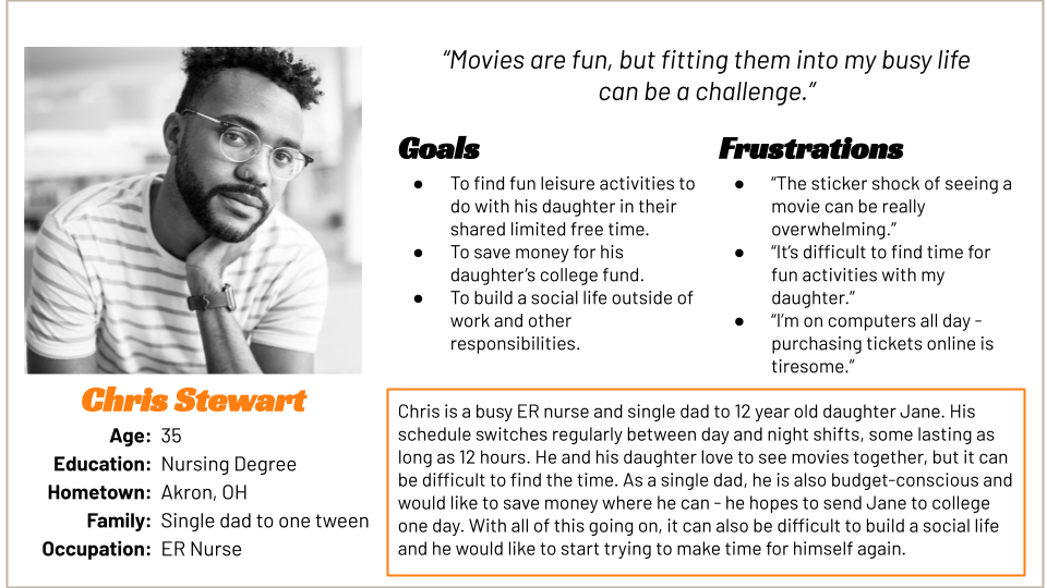
These concerns were reflected in our user personas, including the following for Chris Stewart. Chris is a busy, working, single dad who needs to find a movie that fits both his and his daughter’s busy schedule because their time for leisure activities together is limited.
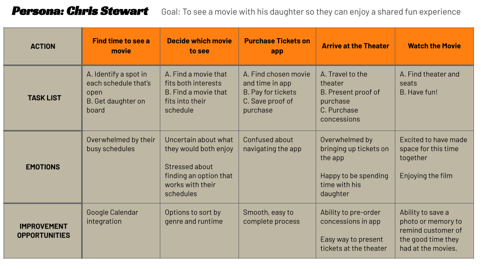
The following user journey helped identify improvement opportunities related to search functionality and purchasing options:
PAPER WIREFRAMES
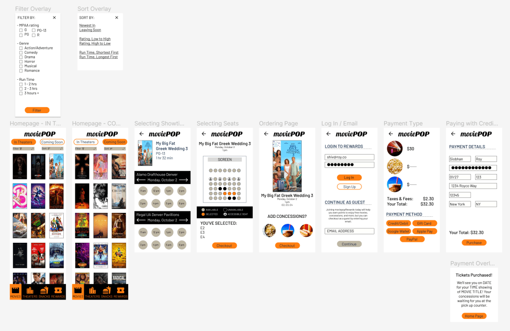
For each page of my initial design – the homepage, filters menu, ordering, selecting seats, and payment – I created five paper wireframes, selecting the best elements of each to build a starting design. This process helped to focus on the most important elements of the design – the movie ticketing function, as well as the enhanced filtering.
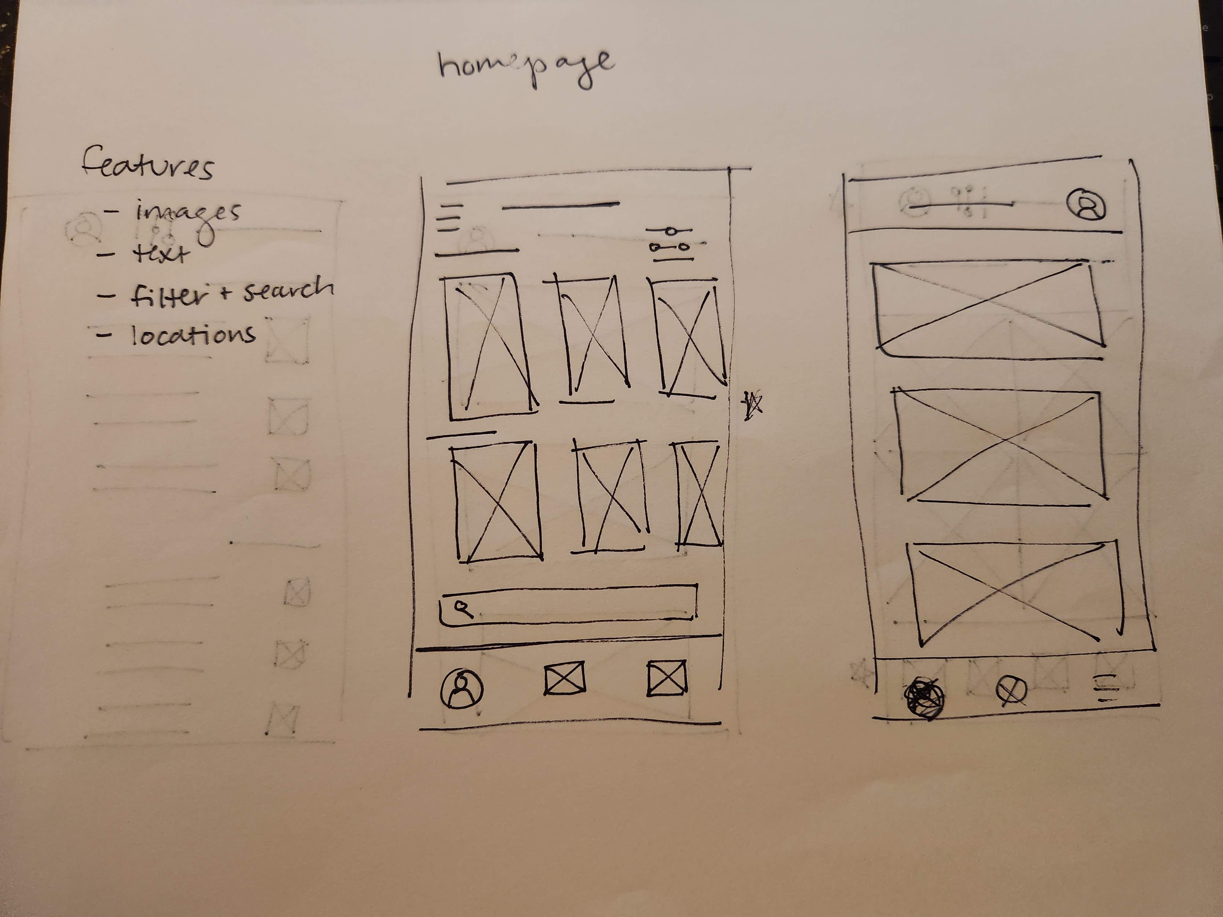
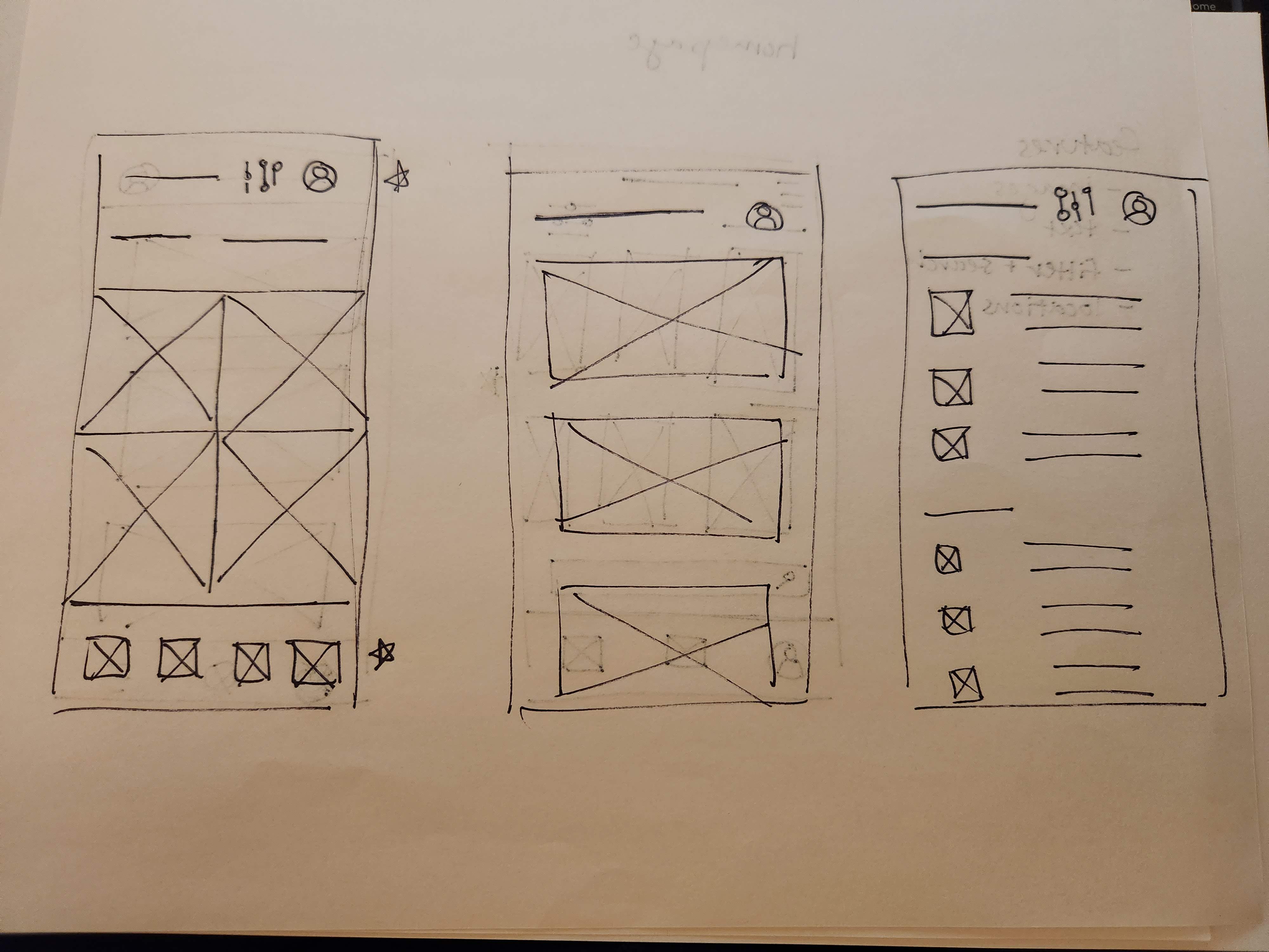
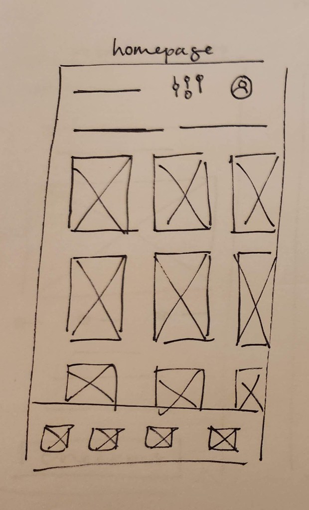
From the five wireframes above, the best elements were chosen (marked with a star) and incorporated into this final wireframe.
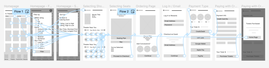
These finalized paper wireframes were then created as digital wireframes in Figma, incorporating the features that were most relevant to our users.
DIGITAL WIREFRAMES

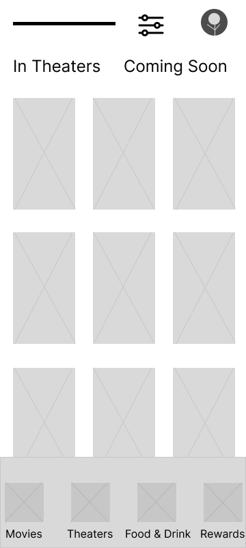
LOW-FIDELITY PROTOTYPE
The low-fidelity prototype incorporated information from the user journey to create a seamless process that could be reviewed by users during the usability testing phase.
USABILITY STUDY FINDINGS
After digital prototyping, an initial round of usability testing was conducted with five participants providing feedback on a low-fidelity prototype. Insights from the user feedback collected during this research were:
- Users found the filtering function to be useful, but:
- Users needed better cues to effectively navigate to the filter feature.
- An email or account log-in prompt should be added to the checkout process.
MOCKUPS
In addition to beginning to lock down the look and feel of the design, I also incorporated the insights from the usability study during the mockup phase. For the filtering feature, this meant making the navigation more clear. Instead of the properties icon, which many of our users found unintelligible, I developed two pop-out menus that were labelled with both text and an icon.
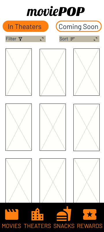
HI-FI PROTOTYPE
Applying design choices and updates throughout the mockups, I developed a high fidelity prototype for a second round of usability testing.
ROUND TWO USABILITY TEST FINDINGS
With the hi-fi prototype, I conducted a second round of usability testing.
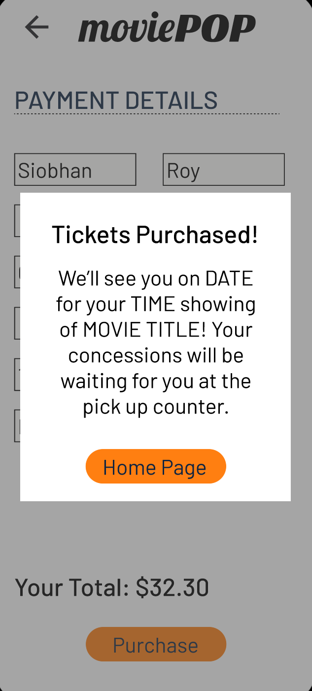
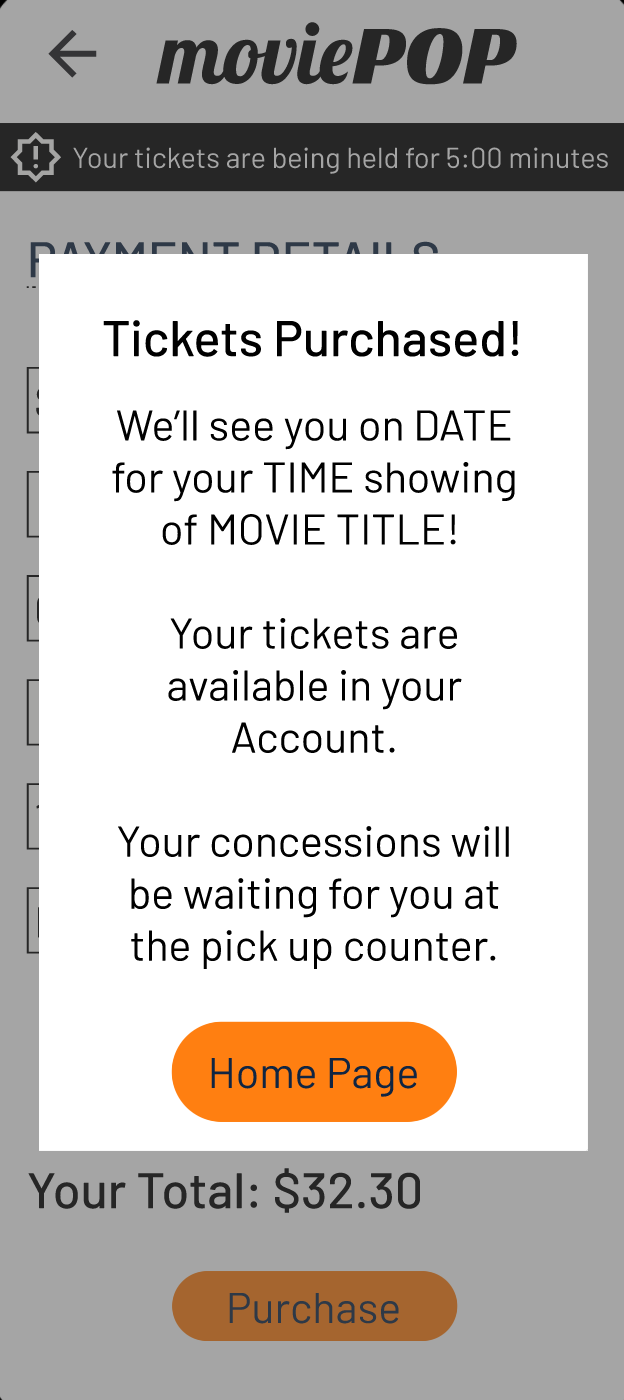
INSIGHT 1: While the ticketing process was easy to complete, it was missing two key elements: a timer, indicating how long seats would be held during the purchase process and an indication of where tickets can be found after purchase.
SOLUTION: A note about tickets being available in the Account was added to the purchase confirmation overlay. In addition, the lower menu was updated to have an Account tab instead of Rewards, to support this update. In addition, a timer alert was added to each step of the checkout process.

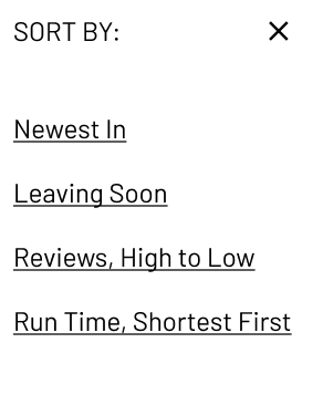
INSIGHT 2: Users had no issues with the filtering menu, but found elements of the sort menu confusing or not well-defined.
SOLUTION: The sort menu was simplified with fewer options, more descriptive language, and better spacing.

ACCESSIBILITY CONSIDERATIONS
Our major accessibility upgrade was in the design of the Filter and Sort menus – the initial design, with the properties icon, was not recognizable to some of our users. By changing to a set of menus that were labeled with both text and icons, these menus were much easier to find and use in our second round of usability testing.
Additionally, our color palette was tested with the Stark Accessibility Tools plug-in for Figma to ensure that the design would be accessible for low-vision and colorblind users. The final design will also use alt-text to describe the images present throughout the process.
TAKEAWAYS
Through these research and design phases, I created an app that is easy to use, functional, and well-designed. To quote one testing subject:
“That was easy!”
Because this was my first beginning-to-end UX design project, it would probably be easier to describe what I didn’t learn! I especially appreciated getting to know Figma, getting practical experience with usability tests, and learning more about design principles.
NEXT STEPS
Before sending this design to the developers, I would like to have one last meeting with colleagues for review to catch any last-minute changes.
Then, I will package the design and sticker sheet for developers so that we can create a launchable version of the app.
After launch, I will develop a continuing research plan in order to identify any problems that users are experiencing while using the app for future updates.
THANK YOU!
If you have any questions about this project or my other work in user experience and research, please reach out:

Leave a comment