PROJECT, DURATION, ROLE
ColdSnap is an app to help our neighbors experiencing homelessness get off the street and access resources during cold weather events. This app was developed during March of 2025 for the completion of the Google UX Design Certificate. I served as the sole researcher, designer, and project manager.
PROBLEM, GOAL
In Colorado Springs, winter weather events are a common occurrence and there is a network of shelters, churches, and other organizations that help during these emergencies. However, information about these resources often travels inconsistently by word of mouth.
My goal in this project was to create an app to help those experiencing homelessness to reserve shelter spaces that fit their needs during cold weather emergencies.
OUTCOMES
I developed an easy-to-use app that guides neighbors that may be in distress through the process of acquiring shelter during cold weather events. This app will keep our community safe and supported during cold weather events, reducing bodily harm and desperate action.
USER RESEARCH
The need for this project was identified by my personal experiences working with houseless neighbors in Colorado Springs. The personas were based on informal interviews and conversations.
It was important for this project to think about the many ways people can be homeless – including living on the street, couch surfing, and living out of a vehicle. These perspectives informed our research and approach to this project.
Persona: Liz
Liz is a neighbor experiencing intermittent homelessness who needs more information about resources during cold weather events because word of mouth in unreliable. In the past, bad information has made her feel frustrated and put her in unsafe situations.

User Journey Map: Liz
Liz’s journey helped us understand the importance of up-to-date information on weather events and availability of shelter.

Persona: Mike
Mike is currently sleeping in his car. He needs to know where he can both seek shelter and safely park his vehicle. It is his most precious resource and without it his situation is unlikely to improve.

User Journey Map: Mike
Through reviewing Mike’s journey, we better understood the importance of knowing what features are available at each shelter, including parking.

**INSERT MIKE USER JOURNEY MAP IMAGE**
PAPER WIREFRAMES
In the paper wireframes, I explored ways to keep the site as simple as possible to walk each user through the process of identifying a shelter that would fit their needs step-by-step. This includes highlighted information and push notifications about upcoming cold weather emergencies. For the most part, the starred features ended up in the final design.

DIGITAL WIREFRAMES
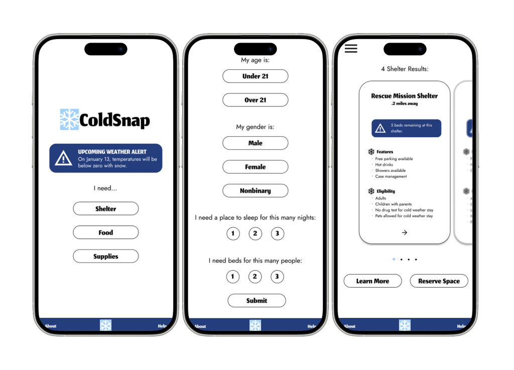
In the digital wireframe stage, we fleshed out the process of searching more. At this stage, I landed on a card carousel for the various shelter options – for ease of use as well as to expand my design experience and Figma skills.

LOW-FIDELITY PROTOTYPE
The low-fidelity prototype fleshed out the broad strokes of the process, including a basic version of a filtering survey to deliver targeted shelter results, features around transportation, and more.

MOCKUPS
In the mockup phase, I not only added design elements but took the opportunity to refocus on the user by adding detail to the survey. I also built out the easy-to-use card carousel that contains critical safety information for our neighbors.

HIGH-FIDELITY PROTOTYPE
The accomplishment I’m proudest of in this hi-fi prototype is the interaction design. I developed a carousel than can be scrolled through as well as interactive buttons. Throughout my design journey, this is my most complete prototype and shows my Figma skills leveling up.

TAKEAWAYS
Impact
This app has the potential to change the lives of people in my community, focusing on the safety and care of an under-served and overlooked group. By bringing the needs of unhoused neighbors to the forefront, we can also create a system between all the resource providers in our community that fosters collaboration, cooperation, and efficiency.
What I Learned
This project was an important opportunity to use my background in serving my community paired with my new UX skills to address critical problems. It has expanded my view of what good design can accomplish. Additionally, challenging myself to simplify my designs and develop new skills in Figma led to the design I’m proudest of so far.
Next Steps
1.
Due to timeline and resource constraints, usability testing was not a part of this project. Before further development, I would like to test this with real people in my community to streamline and improve the design.
2.
There are two other features present in this app idea that need to be built out – the Food and Supplies options. Further development of this app would need to include user flows for addressing these critical needs.
3.
Undoubtedly, increased use of an app like this would inspire others to get involved with this issue in our community. In the future, I would want to iterate features that would allow people to donate time, supplies, and food to this effort.
Thank you for reviewing this case study! If you have any questions about this project or my other work in user experience and research, please reach out.
Leave a comment